
We talked about Kibana installation on Ubuntu in the previous blog post, let’s look at how to setup some basic visualizations using Kibana with Elasticsearch.
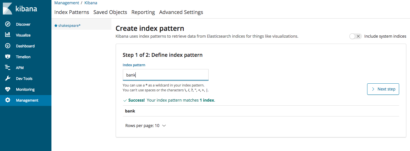
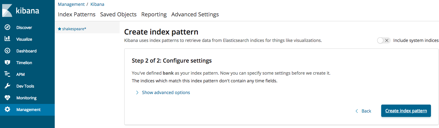
Log into Kibana using http://127.0.0.1:5601. Once the Kibana page opens up, from the left side Menu, click on “Management” and then choose Index Patterns->create Index Pattern and fill in the data as shown below (Once you start typing, it should display “bank” as an option). Go ahead and click next on step 2 and the index will be created and the fields will be displayed.
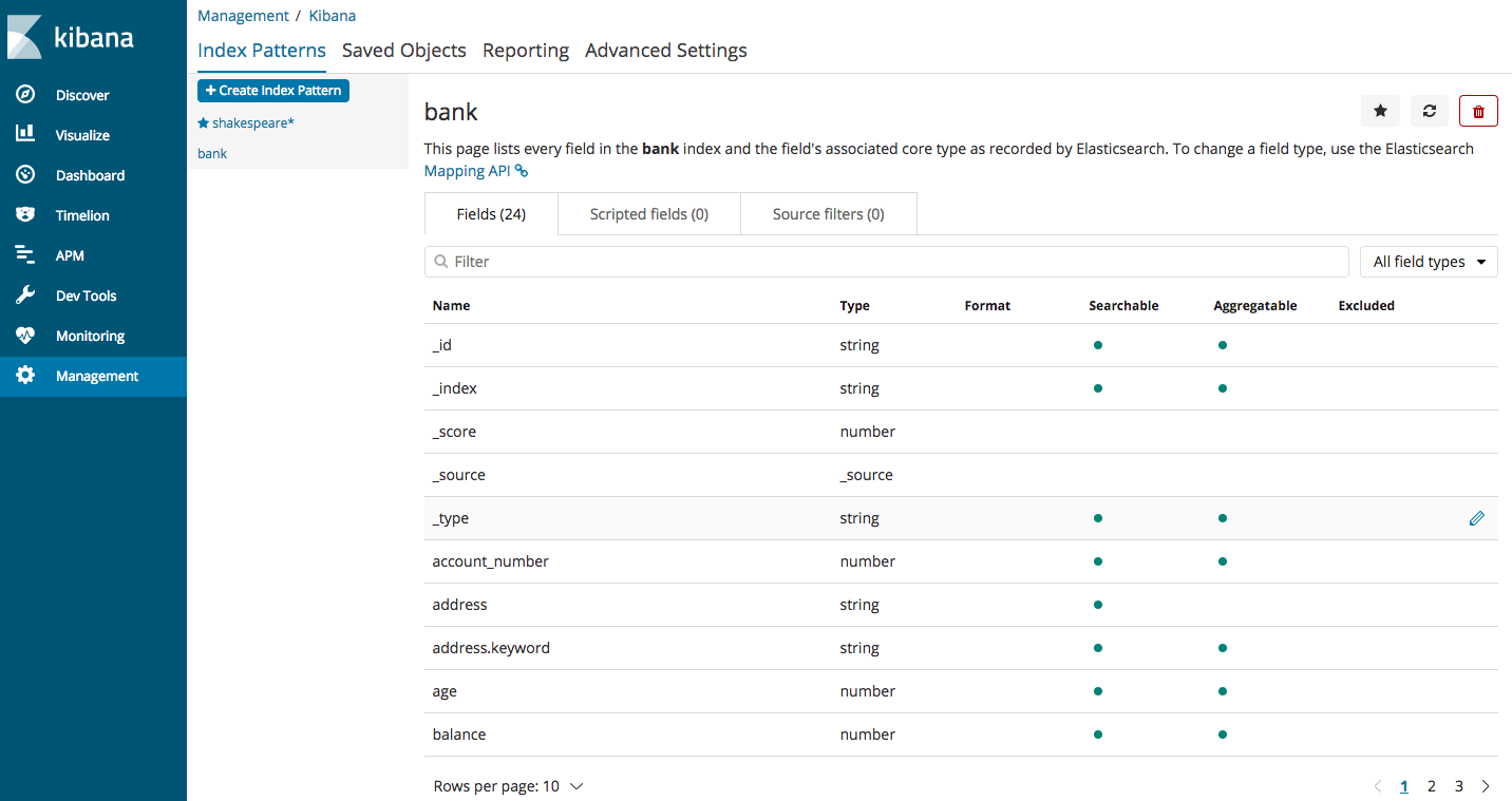
All the fields that are part of the accounts.json file will be displayed here (the file can be downloaded as per steps in the first blog post of this Elasticsearch series)
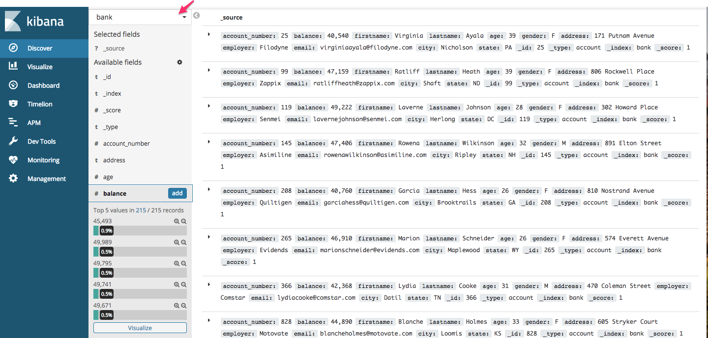
Let’s get a basic understanding of what Kibana offers. From left sidebar Menu, choose the first option “Discover”. Kibana will load data for index “bank”. If you already have more than one index, you can choose from the dropdown as shown below
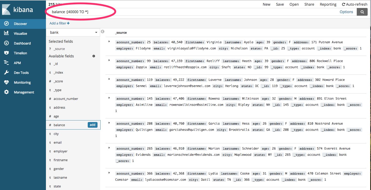
You can use the filters on top of the screen to fetch the data of your choice

You can type them in the field provided above as follows (we are querying for all those accounts where the balance is greater than 40000)
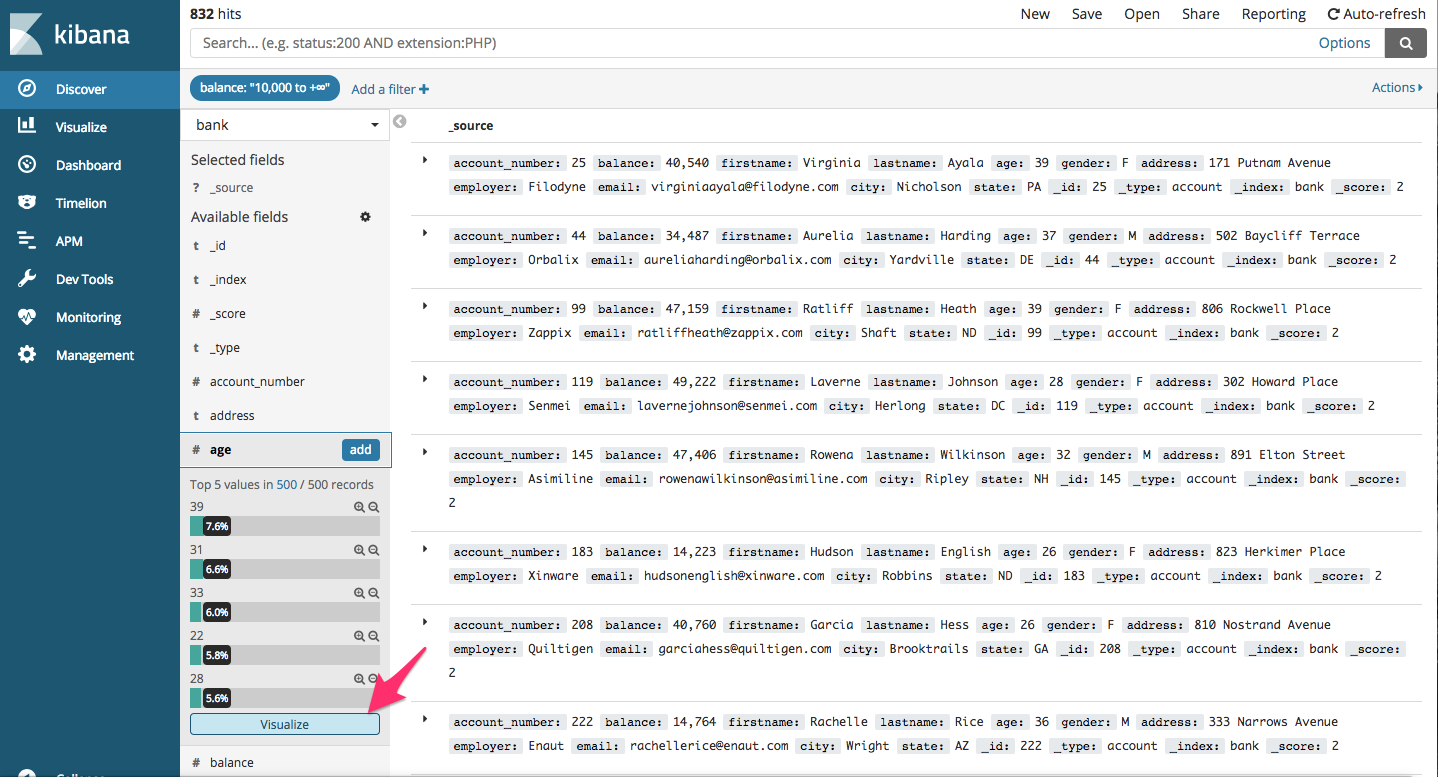
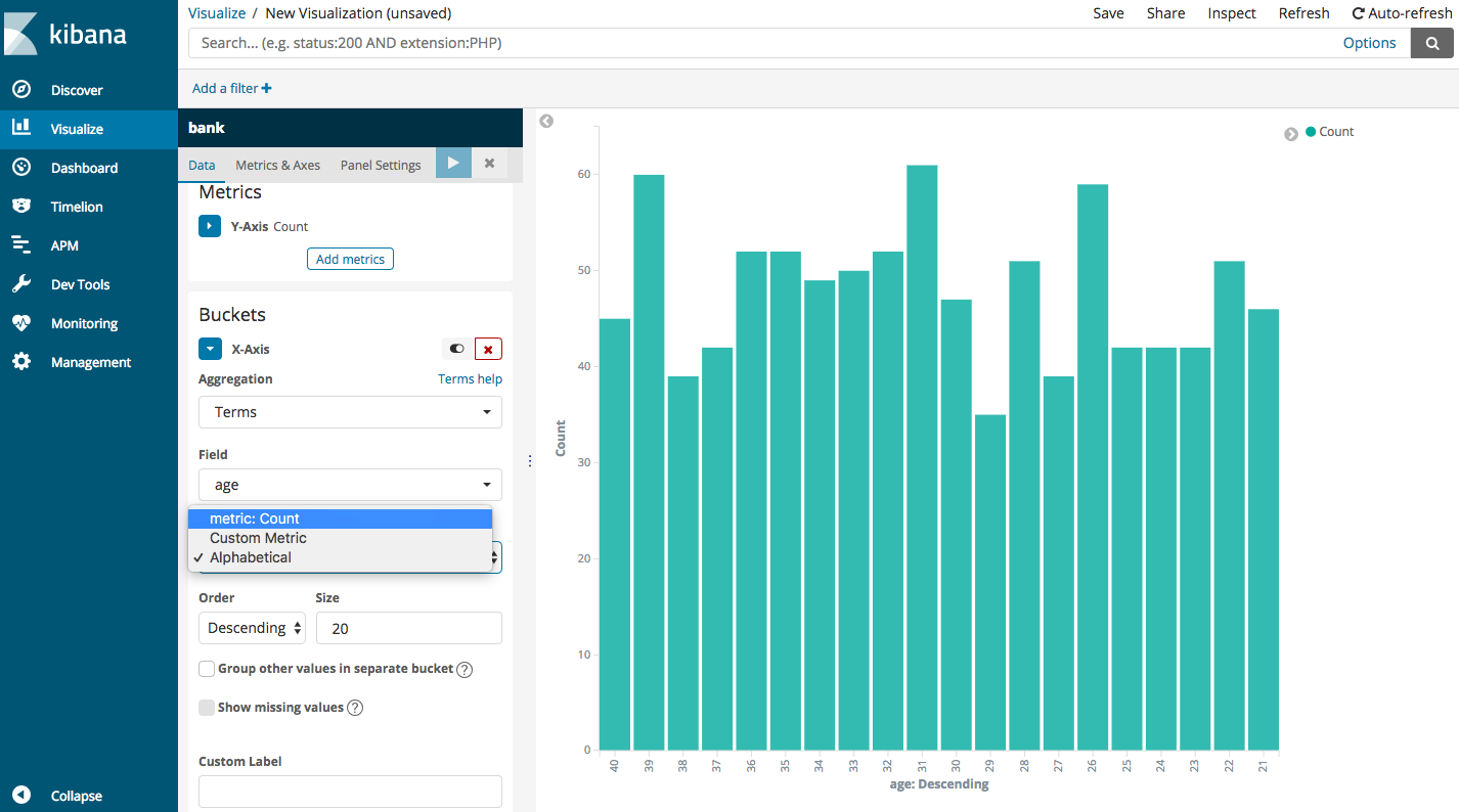
Now, let’s see how many accounts are present for different age groups. So, select age field and click on visualize
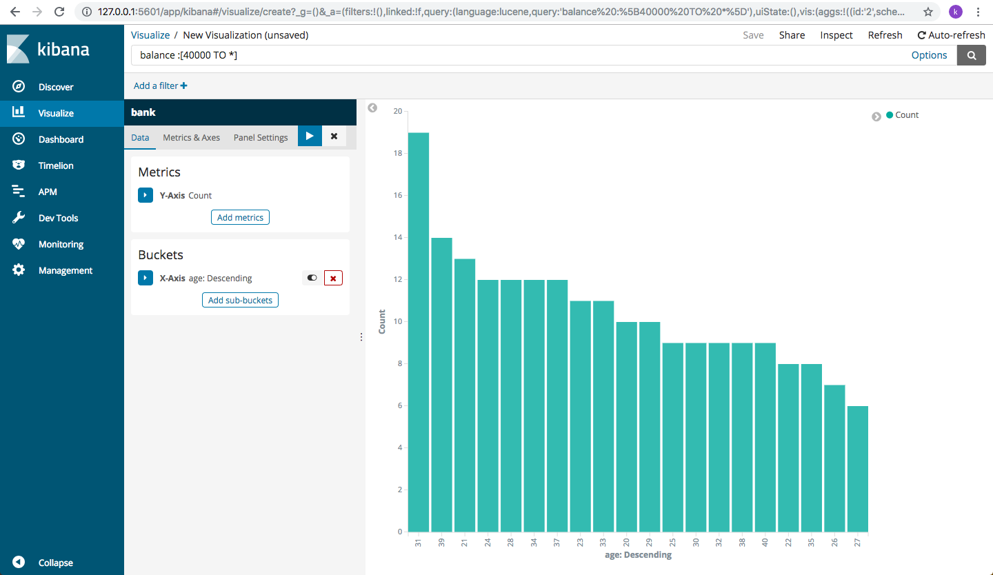
You will get an age wise descending graph depicting the number of accounts present for a certain age with an account balance greater than 40,000
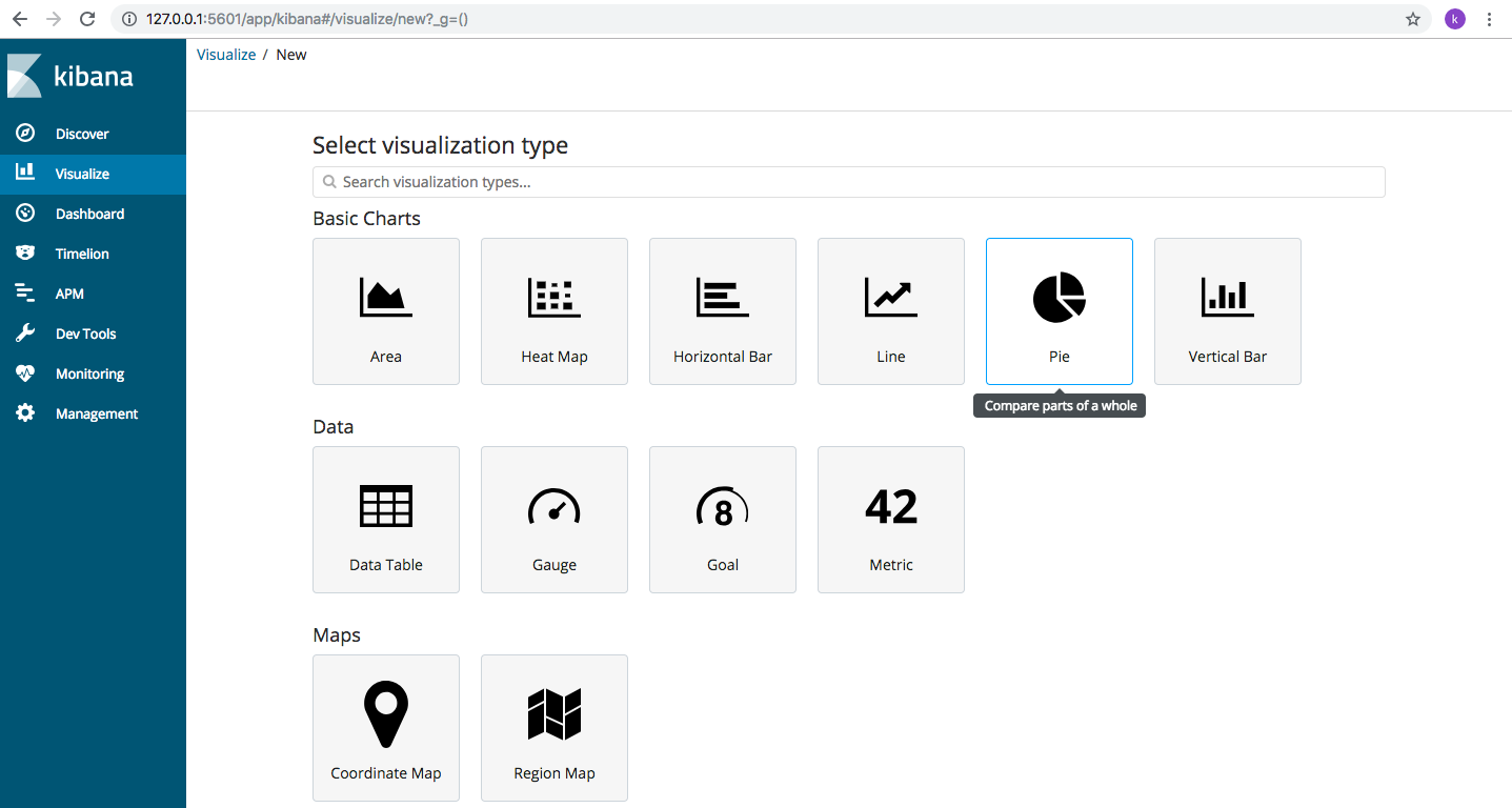
We can also use “Visualize” option from the left side Menu to create useful visualizations for the data. Let’s create a pie chart.
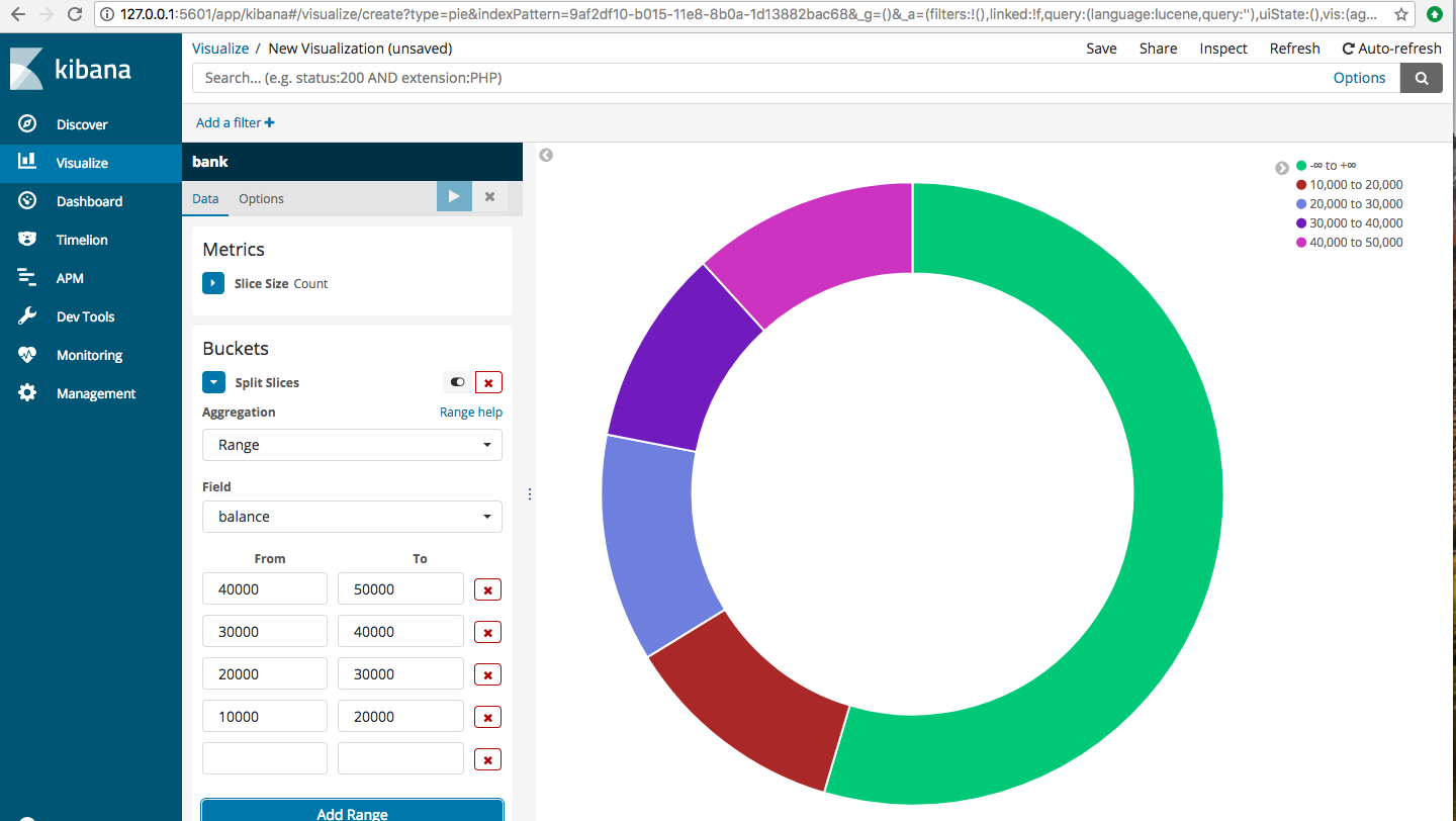
Click on Visualize->Pie
Choose split slices and then aggregation=Range, Field=balance, From and To fields you can give as below or however you wish your data to be divided. The balance ranges are all shown in different colors, depicting the number of accounts in each balance range.
Let’s try another visualization. Click on Visualization->Area(in basic charts). choose the index “bank” and then under “buckets” choose “split chart”->Aggregation=Range, Field=balance, and enter the different ranges for balance. You get to see something like this
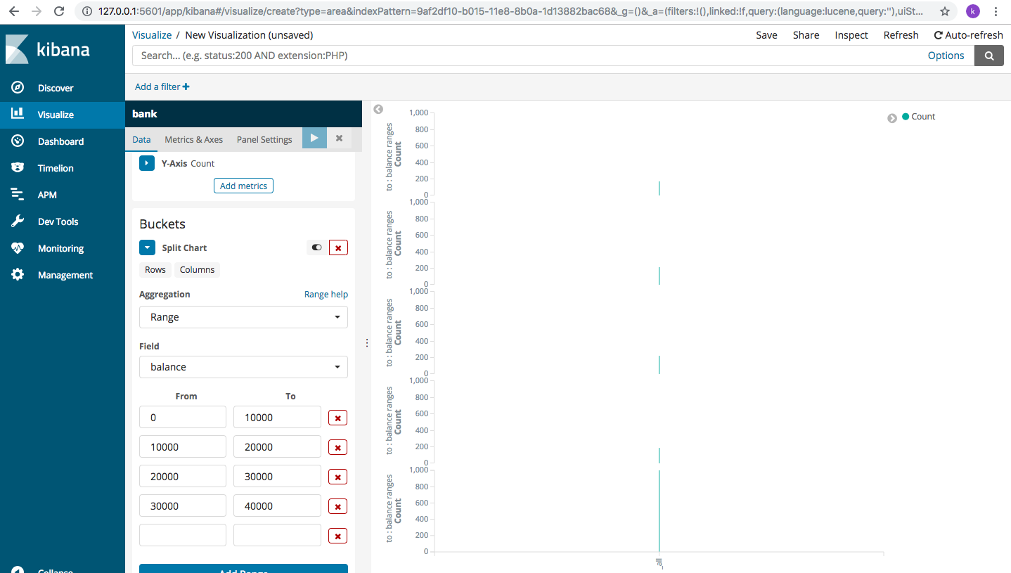
Hmm, not very useful. Let’s change it a bit. Choose “X-axis”under “buckets” and then repeat the same data for aggregation, field and balance ranges.
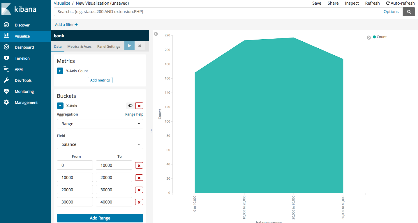
Well, that’s definitely more readable. It’s obvious that the number of accounts are higher for 10000-20000 range than 0-10000. Then, there’s a very slight increase for range 20000-30000 and then it reduces for 30000-40000. Kibana offers a rich suite of visualizations, we just need to learn how to select the right option to make sense of the data that we have.
We can read more about the visualizations, fields, parameters and advanced options offered by Kibana on the official documentation page. You can check it out here:
Now that we are familiar with Kibana interface, lets do some basic search operations using Elasticsearch and replicate the same using Kibana. To do this, we shall use the accounts.json file again. Let’s use that data and gather some insights.
So, let’s say the bank wishes to know about the number of customers it has in each age group. We need to group together data based on customers’ age. This type of clustering of data is called aggregation and is one of the most powerful ways for data analysis.
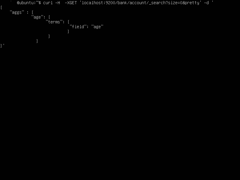
On the command line, you can invoke this aggregation using curl (on the server running Elasticsearch)
curl -H -XGET 'localhost:9200/bank/account/_search?size=0&pretty' -d '
{
  "aggs": {
           "age": {
                   "terms": {
                             "field": "age"
                             }
                  }
          }
}'
Description of the query:
_search in the Curl request says our request is about searching the data, Size=0 specifies that we do not want the entire output of matched documents printed onto our screen. This makes sure that only the result of our aggregation is displayed onto the screen. “pretty” indicates, the output of the query should be in readable format, otherwise, we will have a log file kind of output which is user friendly.
“aggs” says its an aggregate function that we are requesting and “age” is the name of our custom aggregate and “terms” indicates the fields we will be using for running our aggregation. “field” implies each field we will be using.
 and the output will look like
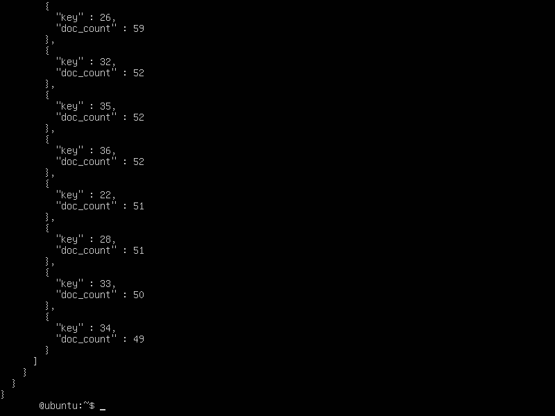
The output shows that the data has been grouped by age along with the number of customers who fall in each age group. (“key” refers to the age of the customer and “doc_count” to the total number of customers who are of the mentioned age).
Let’s visualize the same output on Kibana (you can cross check with the data on the screen above)

To sort by the age of the customer, choose Alphabetical as shown in the screen below:
Let’s say we want to know the number of customers with bank balance greater than 10000, for different age groups. This requires us to filter our search for balance greater than 10,000 and then aggregate them by the age.
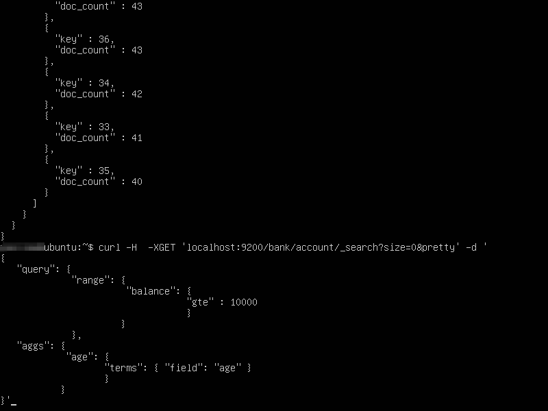

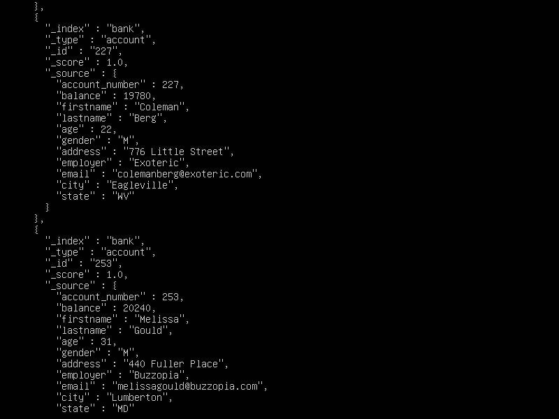
If you wish to see all the documents that are being considered for aggregation, you can run the above command without the “size=0” option. It will display all the documents being considered for aggregation along with the aggregation results.

The output will look like so (Each document whose search criteria is met, will be displayed):
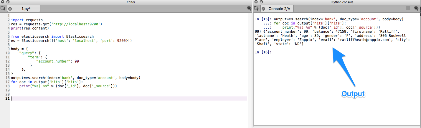
Querying for the same data using Python
import requests
res = requests.get('http://localhost:9200')
print(res.content)

from elasticsearch import Elasticsearch
es = Elasticsearch([{'host': 'localhost', 'port': 9200}])

body = {
"query": {
"term": {
"account_number": 99
}
},
}
output=es.search(index='bank', doc_type='account', body=body)
for doc in output['hits']['hits']:
print("%s) %s" % (doc['_id'], doc['_source']))
I would highly recommend that you practice these visualizations (and some more) on your local dev machine so that you can get a much deeper understanding of these concepts.
Comments